Platform Update: New UX/UI

After many months of working on an updated user interface and design language for our application, we are excited to finally unveil our brand new launchpad experience.
Our number one goal is providing a top-tier sale experience for both community and team, and that means we always need to stay ahead of the curve. While we have received positive feedback about the platform in terms of ease-of-use and design, and even seen others adopt many of our conventions, we are interested in pushing further.
The new Avalaunch UX/UI is the result of community feedback, our own observations, and clearing the runway for some new features to come. 2022 is set to be a tremendous year for both Avalaunch and the Avalanche ecosystem as a whole and we are confident that this upgraded launchpad experience will support this growth.
Let’s get into it!
Homepage
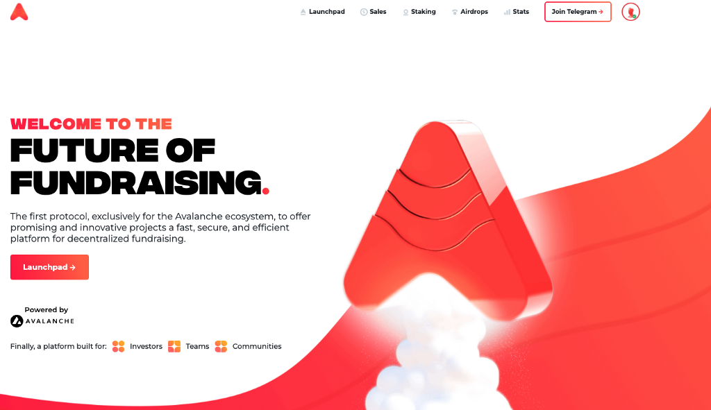
As we adapted and built quickly over the last year, many of our parallel applications and features like the LP farm, KYC portal, audits, etc. needed to be surfaced. Out of necessity, many of these ended up on the homepage where they were most visible. While functional, we felt the flow could be streamlined, and the experience could be more focused.
Our new homepage manages to include everything you need to know about Avalaunch and how to participate, while maintaining a smoother path through the calls to action and information.
It’s important to us that new users to the platform immediately understand our value proposition and what steps to take next. Our redesigned homepage achieves exactly that.
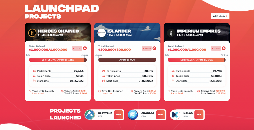
We also added an area that highlights our most recent sales for quicker, at-a-glance participation. Our current and past sales can now be found in many places across the site so users can view and access the latest opportunities hosted on the platform.
My Profile (KYC/Verify/Register)
With our new interface, we have moved the KYC and account creation into one application, removing the need for a new user to navigate across multiple sites to achieve registration. The old KYC application has been removed and everything has been brought into a single domain.
All of the new features can now be found under the improved “My Profile” tab and can be easily accessed or referenced at any time.
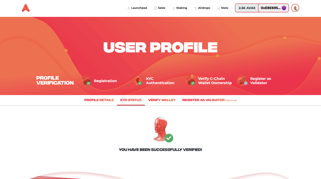
Once on the profile page, you will be able to create an account, complete your KYC, verify (or change) a wallet, and register as a validator (if you run an Avalanche node).
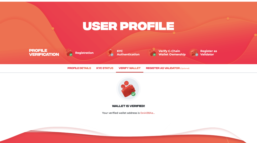
While the old separate applications may not seem terribly problematic, we wanted the Avalaunch experience to be as frictionless as possible.
The “My Profile” page brings the most important first steps forward and into one place, allowing for a smoother experience for new users and those looking to make changes to their account.
Launchpad
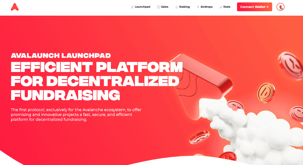
We have also completely redesigned our launchpad application with an emphasis on quick, intuitive participation.
When arriving at the application, a new user will be presented with the immediate next steps they need to go through in order to start participating in sales.
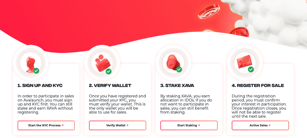
They will also be able to check out the current ongoing sales, as well as past launches and their raise info.
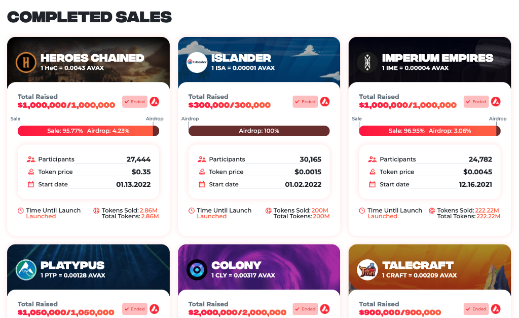
Drilling down to any sale will allow a register/participate or view historical stats, based on sale status.
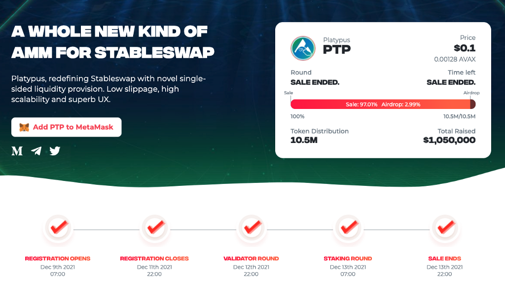
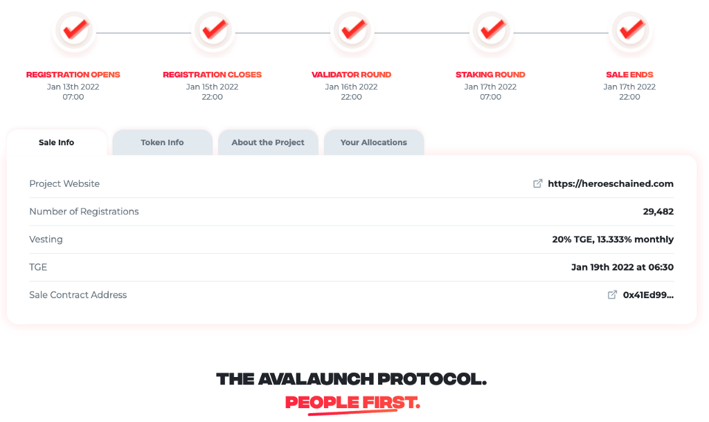
From any sales page, you can also find sale info, tokenomics, the ability to claim you tokens at TGE and any vested portions when they become available.
Sales Page
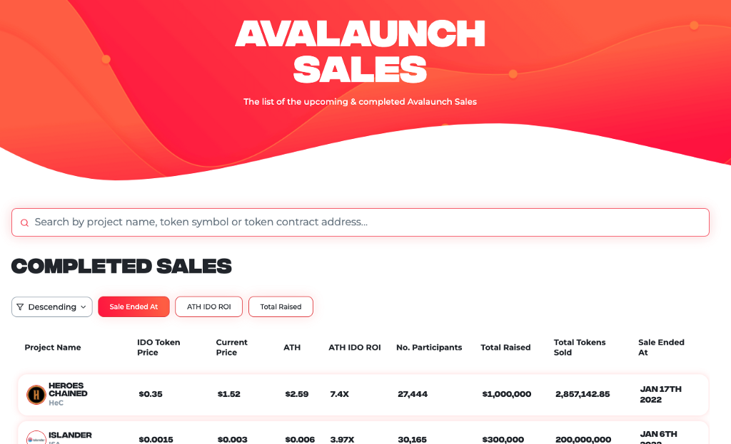
Our sales page is where you will be able to see all of the sales ever hosted on the platform. You can also sort by relevant filters like date, ATHs and total amount raised.
Because we have conducted a long list of sales at this point, the search function will allow you to find the sale you’re looking for quickly and without needing to scroll through pages of past IDOs.
Allocation Staking
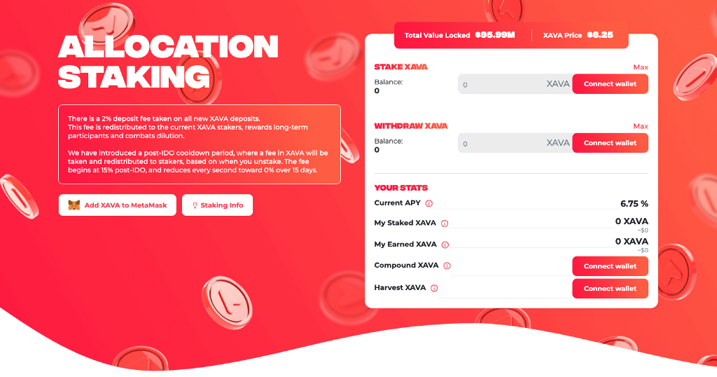
The Allocation Staking page is probably one of the biggest changes to the application, with an entirely upgraded interface to interact with your stake.
From here, you will be able to stake, withdraw, compound, harvest, as well as view:
- Current APY
- Your Current Stake
- Earned XAVA
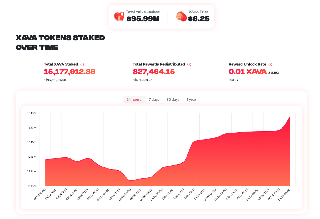
The graphs and TVL sections have also seen a refresh with a focus on clear, easy to digest information.
Airdrops
At Avalaunch, we enjoy a good airdrop. We often surprise our community with IDOs held at our cost and free for the user, as well as drops of unsold tokens after an IDO is complete.
In fact, we do this so often we had to entirely rethink how to make sorting and navigating the claim cards easier for our frequent users.
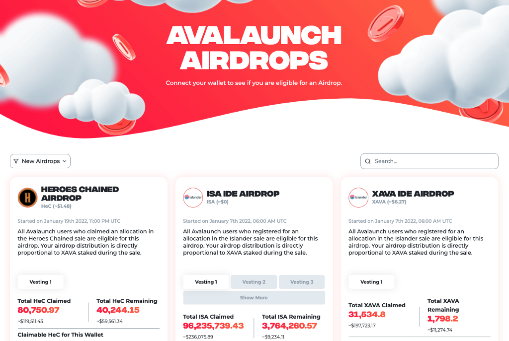
In addition to redesigned cards, we have added a search bar and search filters so you can easily find what you are looking for, and sort by what you haven’t claimed yet.
This was a heavily requested feature that we made sure to include and airdrop recipients can now sort by:
- New Airdrops
- Airdrops You are Eligible For
- XAVA Airdrops
One cool feature of the “Eligble” filter is that it takes into account vested portions, and will resurface tokens you are eligible to claim as they unlock.
No more digging around, checking dates, etc. Just use the filter and whatever is available to claim will be presented. Easy.
Network Stats
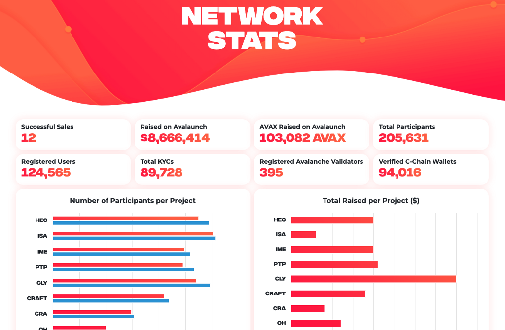
We are very proud of the impact we have had on the Avalanche ecosystem, and we wanted to make sure that users could track it by the numbers.
Our redesigned Network Stats page is your one-stop-shop for every relevant metric to gauge the Avalaunch platform’s reach and performance. With only 12 sales under our belt at the time of writing, we have managed to raise nearly $9,000,000 across almost 90,000 KYC’ed users.
Wrapping Up
As you poke around the site, you’ll certainly find new designs and user flows that we didn’t cover here. And true to form, we already have some additional improvements we are planning to roll out soon.
The new UI is only the first in a series of major upgrades that will reshape the platform and the way our XAVA holders interact with it. We have seen tremendous growth across the last year and we have a tons of new features planned for our v2 application that will ensure we scale along with the ecosystem while honoring our most loyal user base.
Stay tuned!

About Avalaunch
Avalaunch is a launchpad powered by the Avalanche platform, allowing new and innovative projects to seamlessly prepare for launch with an emphasis on fair and broad distribution. With its values deeply rooted in the early Avalanche community, we are able to offer projects confident, informed users who are aligned with the long-term goals of the rapidly expanding application ecosystem.
Leveraging Avalanche’s scalable, high-throughput, and low-latency platform, Avalaunch is built by users, for teams, to help grow strong communities.
![]()
Platform Update: New UX/UI was originally published in Avalaunch on Medium, where people are continuing the conversation by highlighting and responding to this story.
